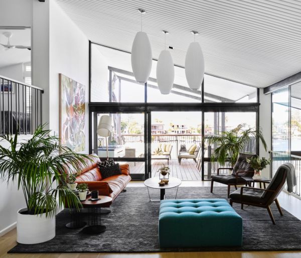
How the ‘rule of three’ can give your home a designer look without the price tag
Three is a magic number. The design concept known as the ‘rule of three’ suggests that things grouped in threes, or in larger groups of odd numbers, are more visually appealing than even numbers. That may mean opting for three vases on a cabinet instead of four, creating visual ‘triangles’ with furniture, or incorporating three colours into a scheme, and many designers swear by this simple yet effective styling trick.
So, why three?
“Good things come in threes,” says Angela Carrick, founder of Air Design Australia, a Sydney-based interior styling and property management company. “Three is the smallest number that can be used to form a distinguishable pattern in our heads. It is used by designers, architects and stylists to create organic-looking, visually-pleasing compositions.”
Whether you’re redecorating, styling to sell, or just updating a tired-looking room, keeping odd numbers in mind could have a big impact.
Penny Middlemiss, founder of Anju Designs, a Brisbane-based interior design studio, keeps the rule of three in mind whenever she’s styling a property. “When you study design, [the rule of three] is one of the first principles that you learn,” she says. “If you have two of something, it often looks very staged. Things arranged in threes or odd numbers are interesting and appealing, they look ‘right’.”
But, remember, when considering the size of your objects and grouping them, each element is not made equal. Middlemiss suggests keeping a ratio of 60/30/10 in mind. Middlemiss thinks that making each item in the trio a different size, texture, or colour tone, rather than having them all the same, can add an extra element of visual interest.
This 60/30/10 rule can also be applied when it comes to designing a room’s colour scheme. Middlemiss always starts with three colours – a primary (60 per cent), secondary (30 per cent), and an accent (10 per cent – but incorporates different tones of these colours for maximum impact). Walls may be neutrals like creams or white, but a primary can be used for cupboards and fittings, a secondary for furniture, fabrics, or curtains, and a splash of accent colour featuring in scatter cushions or artwork.
Visual shapes also play a huge role and creating triangles or pyramids through styling is a trick that designers use often.
Carrick says: “[Creating triangles] can be as simple as rearranging framed family photos of different sizes, colour, or textures into threes which then create that classic pyramid form.
“Books can be used to stack other objects to give them height so that your ‘triangle’ can be easily achieved. Mirrors can give great height to your pyramid or triangle and act as a great base for your laying of objects in the foreground.”
If you have an empty corner, or a space that isn’t quite working, look for ways to build triangles by placing items at either side (the bottom “points” of the triangle) and having a focal point item either taller or elevated (the top “point” of the triangle). An example would be placing two chairs next to a table, then placing a taller decorative item like a vase of flowers on the table, or a framed picture or mirror hanging centrally on the wall above.
And whether it’s gallery-worthy paintings or just holiday photos, rearranging wall art in threes is an easy way to update a room. Try hanging three pieces together, a large piece and two smaller pieces, or hang three similar ones as a triptych for an element of symmetry.
But, rules are also made to be broken, and the rule of three can be considered a “guideline” when the situation calls for it.
Shelley Boyd, founder of Boyd Blue explains, “If I was doing a gallery wall, I might do five or seven pieces as opposed to three. Group in odd numbers. Try to get a focal piece, using that 60 per cent [60/30/10 ratio], then a couple of smaller pieces. I wouldn’t do two pieces of art on a wall without it being broken up with something else to give balance.” If you only have two paintings, try placing a vase, sculpture, or chair below to even things out.
Although smaller pieces work well in odd numbers, large statement artworks may also call for rebelling against the rules. Boyd explains: “If you have a beautiful, large piece of artwork, an over-scaled piece, then you might only want one, as you wouldn’t want to take anything away from that piece.”
Domain reports


